How to Read Cryptocurrency Charts? 

Technical Analysis
12 min read time
|Updated: 2026-05-13
Cryptocurrency charts are among the fundamental tools of technical analysis for users who wish to analyze the price movements of digital assets. When reading cryptocurrency charts, market behavior can be assessed based on data such as trend direction, support and resistance levels, trading volume, and price movements.
Especially in highly volatile cryptocurrency markets, chart analysis can help users track price movements more closely. By evaluating candlestick charts, trend structures, and technical analysis patterns, users can analyze the overall market trend in greater detail.
What is Cryptocurrency Chart?
Cryptocurrency charts are tools that visually display the price movements of digital assets over specific time periods. Thanks to these charts, which are used in technical analysis, investors can more easily track price changes, trend directions, and key levels in the market.
The patterns, support and resistance zones, and trend structures found in cryptocurrency charts can provide insights into interpreting market movements. Using this data, users can assess potential entry and exit levels, trend reversals, and the general direction of price movements.
The fact that cryptocurrency markets are open 24/7 and exhibit high volatility makes chart analysis even more critical. Since sudden price movements can create both risks and opportunities in a short period, users may prefer to closely monitor technical analysis data.
How to Read Crypto Charts?
When analyzing crypto charts, fundamental data such as chart types, trend structures, support and resistance levels, and trading volume are evaluated together. In the process of reading crypto charts, users must first understand basic concepts such as chart types, trend structures, and support and resistance levels. These concepts form the foundation for interpreting price movements in the crypto market.
Crypto charts allow users to visually track price changes of an asset over specific time periods. Thanks to these charts, investors can more easily analyze market direction shifts, buying and selling pressure, and notable price levels.
How are currency pairs, price, time frames, and volume interpreted?
To accurately read cryptocurrency charts, it is necessary to evaluate not only candlestick patterns but also fundamental data such as currency pairs, price movement, time frames, and trading volume. These elements can help provide a more accurate interpretation of market movements.
The pair represents the value of one cryptocurrency relative to another. For example, the
BTC/USDT pair shows Bitcoin’s price against USDT. Users who perform technical analysis, in particular, can track price movements more clearly by selecting the appropriate pair for their trades.
Price movements are shaped by the balance of supply and demand in the market. The ups and downs observed on a chart can provide insights into investor behavior. However, the chosen time frame is also crucial when evaluating price movements. While short-term charts show faster and more volatile movements, long-term charts can facilitate the analysis of the overall trend.
Trading volume, on the other hand, indicates the amount of buying and selling that occurs within a specific time frame. High volume can be interpreted as an increase in market interest, while during periods of low volume, price movements may appear weaker. In technical analysis, volume data is frequently monitored to assess the strength of a trend.
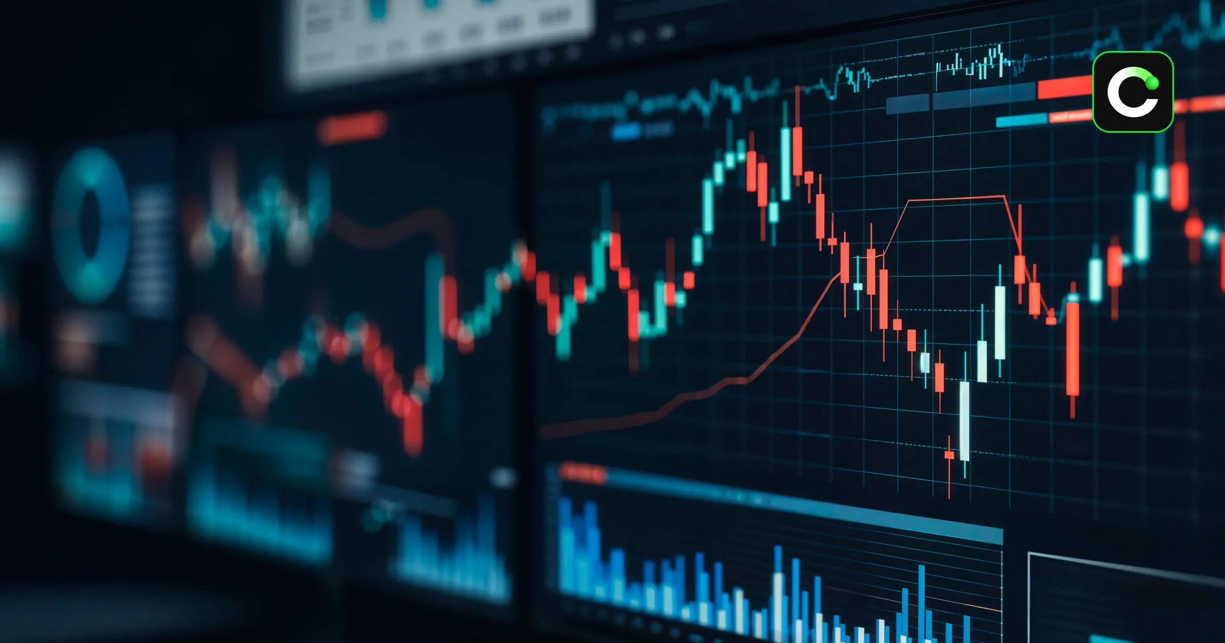
Different Types of Crypto Charts
In technical analysis, various chart types are used to interpret price movements. The most commonly used chart types in the cryptocurrency market are line charts, bar charts, and candlestick charts. Each chart type presents price data in a different way and allows investors to assess market movements from different perspectives.
Line Chart
A line chart is one of the most basic types of charts. It is typically created by connecting the closing prices over a specific time period with a line. Thanks to its simple structure, it is preferred by users who want to see the general direction of the price and quickly track the trend.
Bar Chart
Bar charts display the opening, closing, high, and low price levels for a specific time period. This structure allows for a more detailed analysis of price movements compared to line charts. It provides more data, particularly for users interested in examining short-term price changes.
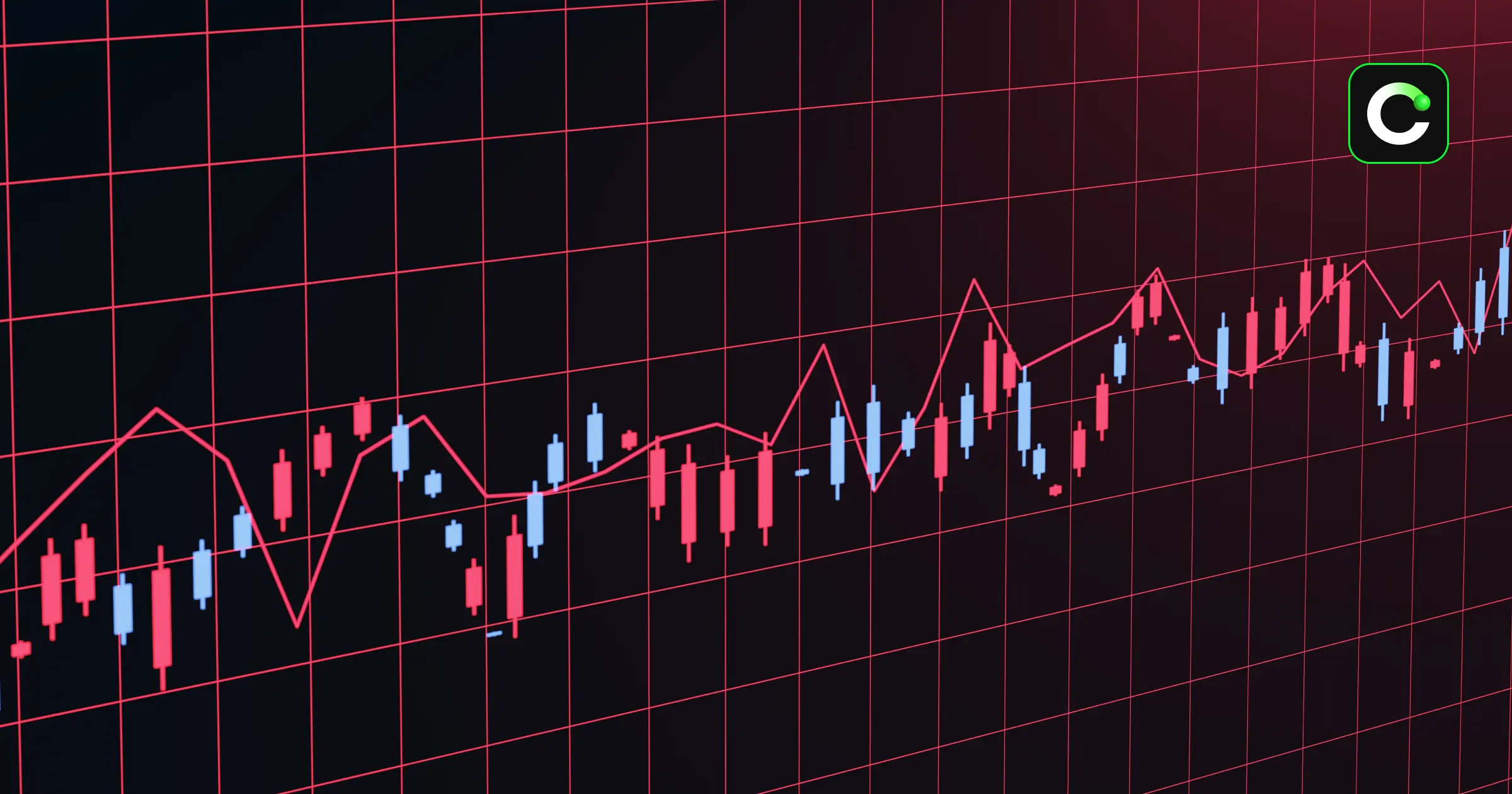
Candlestick chart
Candlestick charts are among the most commonly used chart types in technical analysis. They are frequently preferred by investors because they present opening, closing, high, and low price information in a more visually intuitive manner.
How to Read Candlestick Chart?
In the process of reading cryptocurrency charts, candlestick charts are among the most commonly used analysis tools.
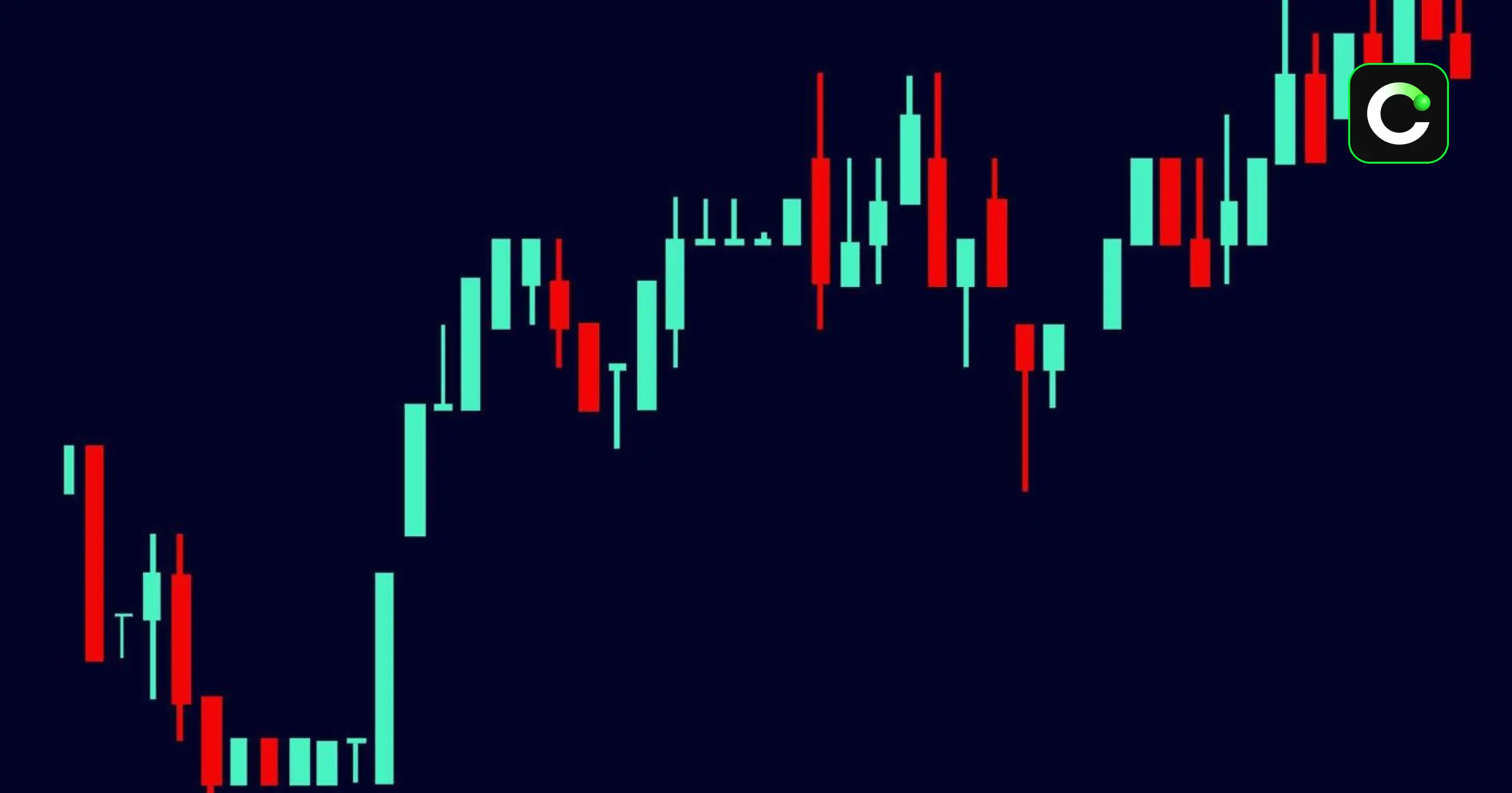
Candlestick charts help visually display price movements over a specific time period.
Each candlestick includes the opening, closing, highest, and lowest price levels. Users can analyze charts across different time frames, such as 1 minute, 1 hour, or 1 day.
The body of the candlestick shows the difference between the opening and closing prices, while the wicks represent the highest and lowest levels the price reached.
Generally, green candlesticks indicate an uptrend, while red candlesticks indicate a downtrend. This structure allows investors to more easily interpret buying and selling pressure in the market.
Open, close, high, and low prices
Each candlestick on a candlestick chart contains four key price data points for a specific time period. These data points are referred to as the open price, close price, high price, and low price. A proper understanding of these concepts is essential for interpreting price movements in technical analysis.
The opening price represents the first transaction price within the relevant time period. The closing price, on the other hand, is the last transaction price within the same time period. The high price indicates the highest level reached during that period, while the low price represents the lowest level observed.
When these four data points are evaluated together, a clearer assessment of buying and selling pressure in the market can be made. In particular, the position of the closing price relative to the opening price can provide important signals regarding the direction of price movement.
What does the body, wick, and candle color signify?
In candlestick charts, the body represents the difference between the opening and closing prices over a specific time period. While each candlestick shows the price movement for the selected time frame, the color of the body helps determine whether the price rose or fell during that period.
Generally, green candles indicate that the closing price was above the opening price, signaling an upward price movement. In this case, the lower part of the body represents the opening price, while the upper part represents the closing price. In red candles, the closing price is below the opening price. This pattern can be interpreted as indicating that downward pressure was dominant during the relevant time period.
The thin lines above and below the candle are called wicks or shadows. The upper wick indicates the highest level the price reached, while the lower wick indicates the lowest level. This structure allows investors to evaluate price movements and buying/selling pressure in the market in greater detail.
What is Trend in Crypto?
A trend is one of the fundamental concepts of technical analysis that describes the direction in which prices move over a specific time period. In the cryptocurrency market, correctly interpreting trends can help investors assess the market’s overall direction. In technical analysis, considering the current market direction is a key factor.
Trends are generally classified into three distinct structures: uptrend, downtrend, and sideways market. An uptrend refers to an upward-moving structure where prices form higher highs and higher lows. A downtrend, on the other hand, indicates a downward movement characterized by lower highs and lower lows. In a sideways market, prices move within a specific range without a clear direction.
Uptrend
Bullish patterns are technical analysis structures that indicate the price may reverse its direction upward following a downtrend. These patterns can be interpreted as a sign that selling pressure is weakening and buyers are beginning to gain the upper hand in the market.
Common bullish patterns closely monitored in technical analysis include the double bottom (W pattern), cup pattern, inverse head and shoulders, falling wedge, and diamond pattern. These patterns are typically confirmed when the price breaks through specific resistance levels.
The double bottom formation occurs when the price tests similar bottom levels twice before moving upward. The cup formation, on the other hand, creates a rounded structure indicating a more gradual transition from a downtrend to an uptrend. The inverse head and shoulders pattern stands out with its three-low structure; the falling wedge pattern may signal a potential upward move following a narrowing downward trend. The diamond pattern, on the other hand, is one of the rarer formations associated with trend reversals.
These patterns can be used in technical analysis by investors to assess the likelihood of a market trend reversal.
Downtrend
Bearish patterns are technical analysis formations that indicate the price may reverse direction downward following an upward movement. These patterns can be interpreted as a sign that buying pressure is weakening and sellers are beginning to gain the upper hand in the market.
Common bearish patterns closely monitored in technical analysis include the double top (M-shaped pattern), triple top, head and shoulders (H&S), and rising wedge patterns. These patterns are typically confirmed when the price falls below key support levels.
The double top formation occurs when the price reaches similar peak levels twice in succession and then pulls back. The triple top formation, on the other hand, indicates that the price has tested the same resistance zone several times but has been unable to continue its upward movement. The head and shoulders pattern, with its three-peak structure, is among the most well-known bearish patterns; the ascending wedge pattern, on the other hand, can be observed when an upward trend weakens and a potential trend reversal may be on the horizon.
These patterns can be used by investors in technical analysis processes to assess potential shifts in market direction.
Also see.
Crypto chart patterns
Sideways Market
A sideways market refers to a market structure in which prices move within a specific range over a certain period without forming a clear upward or downward trend. During this period, prices typically fluctuate between support and resistance levels, and no distinct direction emerges in the market.
In sideways market periods, buyer and seller pressure are seen to be roughly balanced. As a result, price movements may remain more limited, and trend formation may weaken. In technical analysis, this structure can also be interpreted as a consolidation or squeeze process.
Some investors view periods of a horizontal market as a crucial phase for monitoring potential breakout movements. A strong breakout of the price beyond support or resistance levels may signal the start of a new trend.
What are Support and Resistance Levels?
A support level is defined as an area where increased buying demand slows or halts a price decline. A resistance level, on the other hand, refers to an area where selling pressure increases and the price struggles to rise. These areas may form because investors frequently execute buy or sell transactions at similar price levels.
In technical analysis, support and resistance levels are frequently monitored to evaluate potential entry and exit points. A strong move by the price below the support level or above the resistance level is referred to as a breakout. This situation may be interpreted by some investors as the beginning of a new price movement.
When the price returns to the relevant level after a breakout and reacts, this is referred to as a retest. During this process, the former resistance level may act as support, and the former support level may act as resistance.
Why is Volume Data Important on a Chart?
Trading volume refers to the total number of trades executed within a specific time frame and is one of the key indicators used in technical analysis to assess the strength of price movements.
Crypto volume data makes it easier to determine whether market interest is increasing.
High trading volume generally indicates an increase in the concentration of buyers and sellers in the market. This situation can be interpreted as price movements being more strongly supported. During periods of low volume, however, price movements may remain more limited, or the current trend may appear to be weakening.
In technical analysis, volume data is also used to confirm upward and downward trends. For example, an increase in trading volume as prices rise may signal growing market interest. Sudden changes in volume can make it easier to track major investor activity or shifts in market interest.
A correlation may also exist between investor interest and trading volume in the cryptocurrency market. In particular, increased interest in specific projects can lead to notable fluctuations in trading volume.
What can you look for when tracking crypto charts on CoinTR?
When tracking crypto charts on CoinTR, users can evaluate key technical analysis data such as price movements, trading volume, support and resistance levels, and trend patterns all at once. During the chart analysis process, short- and long-term price movements can be analyzed across different time frames.
Since price movements in the cryptocurrency market can change rapidly, it is important for live cryptocurrency charts to provide real-time data. On CoinTR, users can track market movements by switching more easily between different currency pairs while buying and selling cryptocurrencies with TRY. Price movements between USDT and TRY pairs, in particular, can also be evaluated during technical analysis processes.
User experience is also a key factor in technical analysis processes. The easy buy-sell transactions, fast transaction infrastructure, and accessible chart screens offered by CoinTR can help users track the market more efficiently. Additionally,
fast registration and
identity verification (KYC) processes, along with the TRY deposit infrastructure, can help users access trading processes more conveniently.
 2026-05-13
Legal Notice
The information, comments, and evaluations contained in this content do not constitute investment advice. This content is not intended to be prescriptive in any way and is intended to provide general information. It does not constitute investment advice. CoinTR cannot be held responsible for any transactions made based on this information or any losses that may arise.
 What Is Candlestick Chart? How Do You Read Candlestick Chart?
Recommended
 Technical AnalysisUnderstanding Support & Resistance Levels in the Crypto Market Summary: Support and resistance levels are key technical analysis zones in cryptocurrency markets where prices may reverse direction or continue their current trend. Investors can use tools such as moving averages, Fibonacci levels, and trend lines, in addition to past price movements, to identify support and resistance points. While support and resistance levels play a significant role in developing trading strategies, they should be evaluated in conjunction with trading volume,2026-06-22
 Technical AnalysisWhat Is Market Maker? Summary: A market taker is a market participant who executes trades by matching existing buy or sell orders. Rather than adding new liquidity to the market, market takers use existing liquidity to ensure that trades are executed quickly. While a market maker adds liquidity to the order book, a market maker participates in the trading process by matching existing orders. A market taker refers to the party that executes a trade using existing buy or sell orders waiting in the2026-06-15
 Technical AnalysisWhat Is Market Maker? Summary: Market makers contribute to maintaining liquidity in the markets and ensuring smoother trading by continuously providing bid and ask prices. A market maker quote is the bid and asks price and volume information submitted to the system by an authorized market maker. In crypto markets, market makers do not directly set prices, but they can help balance bid-ask spreads and limit sudden price movements by increasing liquidity. Sufficient liquidity is necessary for tra2026-06-09


